Dahlia-Delight – Framed Canvas
I started with the dahlia because it's a flower that doesn't do anything halfway. Layer after layer of petals, each one catching light differently. I wanted to build that depth with quilled paper, so every petal got rolled, shaped, and positioned to have its own dimension. The result is a flower that reads as fully three-dimensional even though it's flat on the wall.
The color story here was key. I used magenta as the dominant color, but I didn't stop there. I let the petals fade from deep hot pink to lighter magentas and even pale whites at the edges, especially on the outer ring. The center got that warm yellow-gold treatment with darker stamens in the middle to give the whole thing a focal point. Each petal has striations in the paper itself, which means the color shifts as you move around the bloom.
Then came the spiraled stem. I wanted something playful to balance all that structured petal work, so I created these loose, organic green coils that curve up both sides. They're quilled from narrow strips, so they have that delicate spring-like quality. The contrast between the tight, architectural petals and those wandering green tendrils is what makes this piece feel alive.
This is a finished dahlia, full and open, at its absolute peak. It sits centered and confident against the black background, which makes the magenta and whites glow. There's no apology in this flower, just bloom.
---
The canvas texture gives these petals a subtle sheen and tactile quality that brings them closer to the original quilled work. When framed, the piece gains a gallery presence. The magenta stays saturated, the yellows in the center glow, and the black background becomes a true void that pushes the whole flower forward. The green spirals curve right up to the frame edge, so the composition feels contained but not cramped.
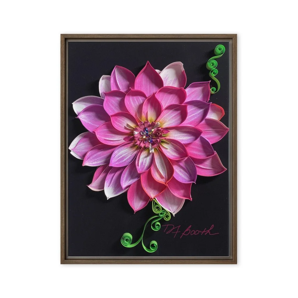 Image 1 of 9
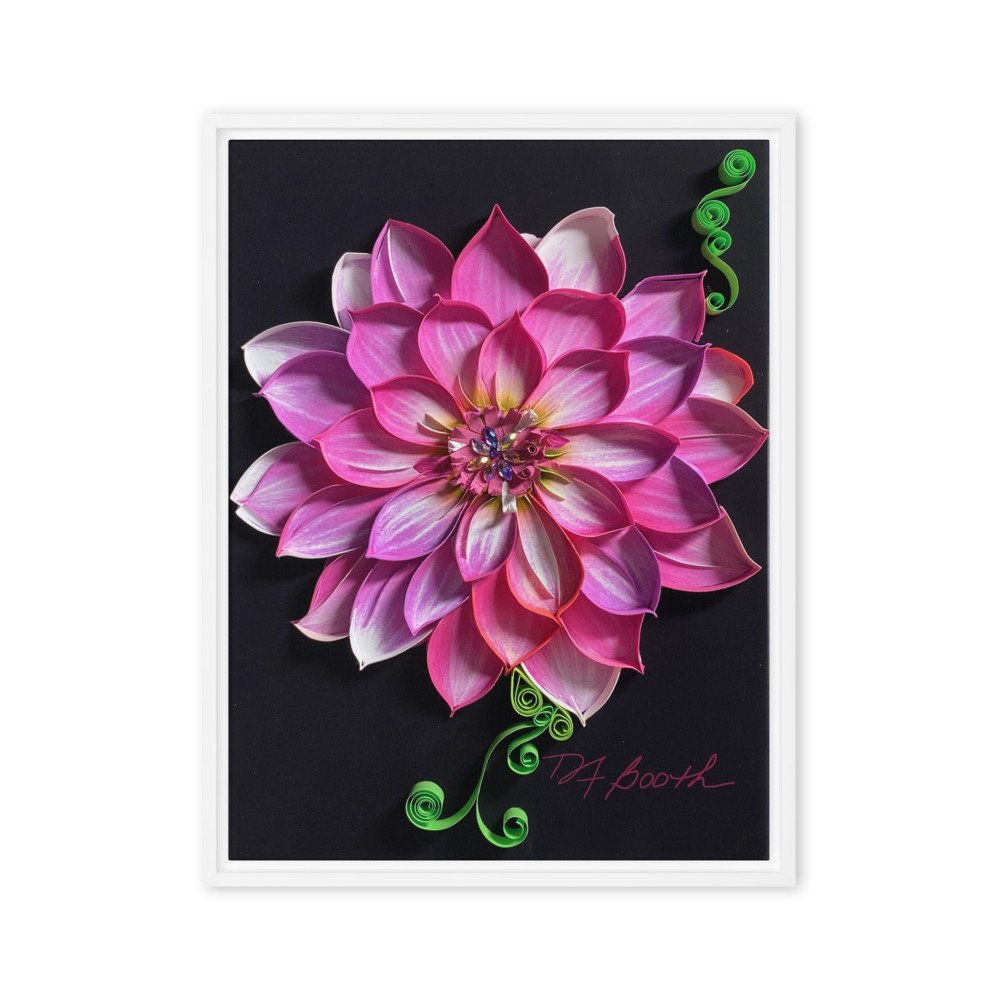 Image 3 of 9
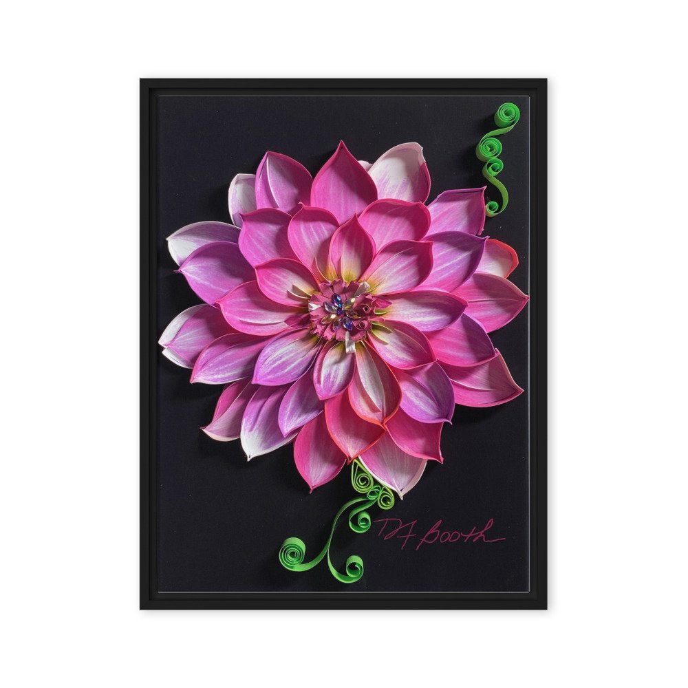 Image 4 of 9
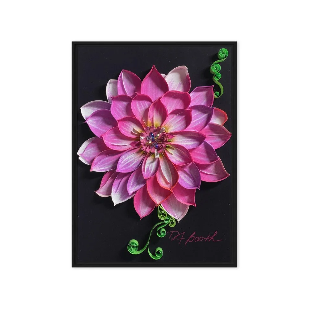 Image 7 of 9
 Image 8 of 9
 Image 9 of 9