Drops-Of-Happy – Framed Poster – Matte Finish
I wanted to make something that felt like joy scattered across a surface. No grand narrative, no single focal point, just a lot of color arranged in a way that makes you smile when you look at it.
The piece is built from hundreds of individual quilled paper teardrop shapes. Each one starts as a thin strip of colored paper, rolled into a coil, then pinched at both ends to form that characteristic leaf or petal shape. I made them in every color I could find: hot pinks, deep purples, ocean blues, forest greens, bright oranges, warm golds, soft yellows, and cool teals. Some have solid color throughout. Others are striped, where I rolled two or three different colored strips together to create that gradient effect inside each drop. The white borders on every piece come from the paper's edge, which gives the whole composition a stitched, handmade quality.
I arranged them tightly across a pale purple background, angling each drop in a slightly different direction so they feel loose and organic rather than gridded. There's a real rhythm to it once you start looking. Your eye doesn't rest in one spot. It bounces from the pink cluster on the left to the green concentration in the center to the purple streak running down the right side. The density is consistent across the whole piece, which keeps the energy level steady. Nothing fights for dominance. It all matters equally.
This one is exactly what the title suggests. It's happy. No apologies, no layers of meaning underneath. Just color and shape and a whole lot of small things that add up to something bigger.
---
The matte finish keeps the focus on the shapes and the careful color work rather than reflections. Every quilled drop reads clearly, from the tightly packed clusters of hot pink on the left to the scattered cool blues on the right. The striped pieces really show their detail on matte paper, where you can trace each color band without glare. The pale purple background becomes a true neutral stage for all that color activity.
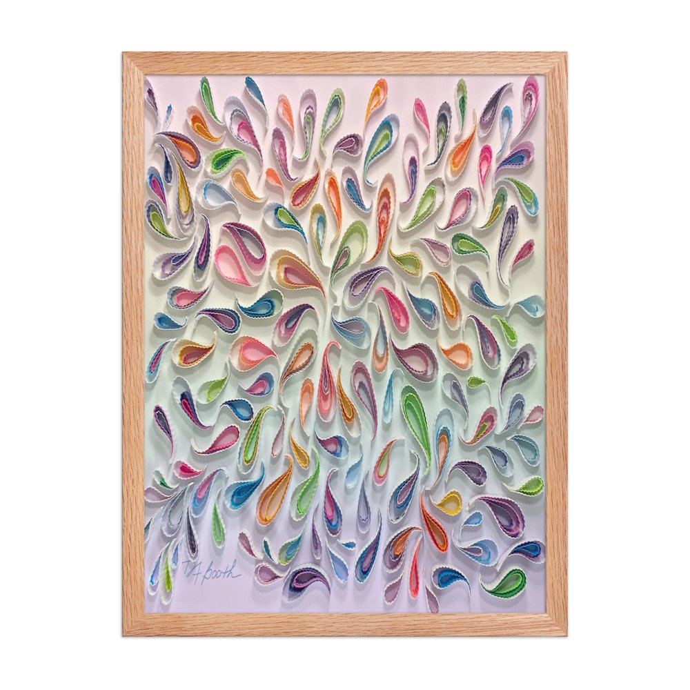 Image 1 of 9
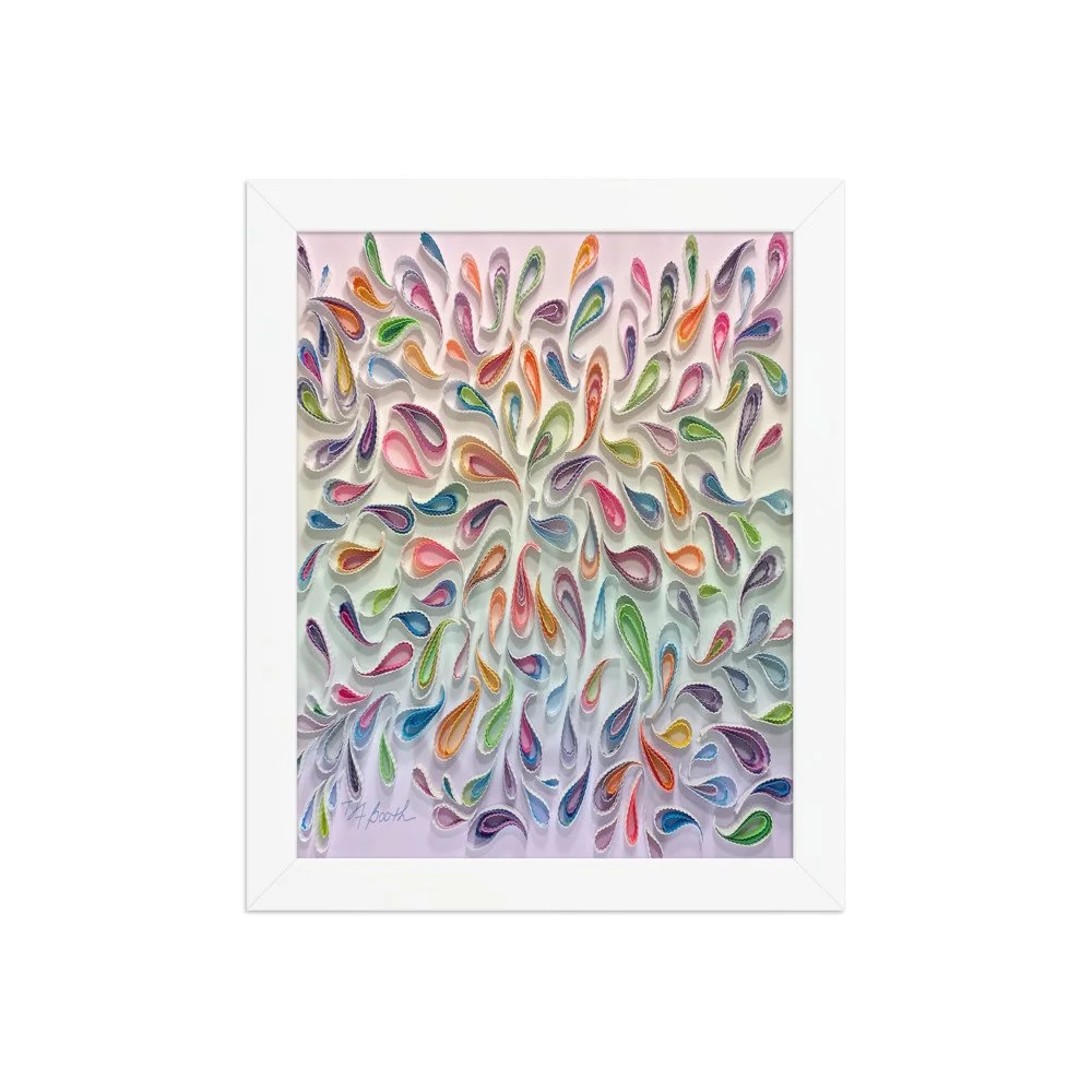 Image 2 of 9
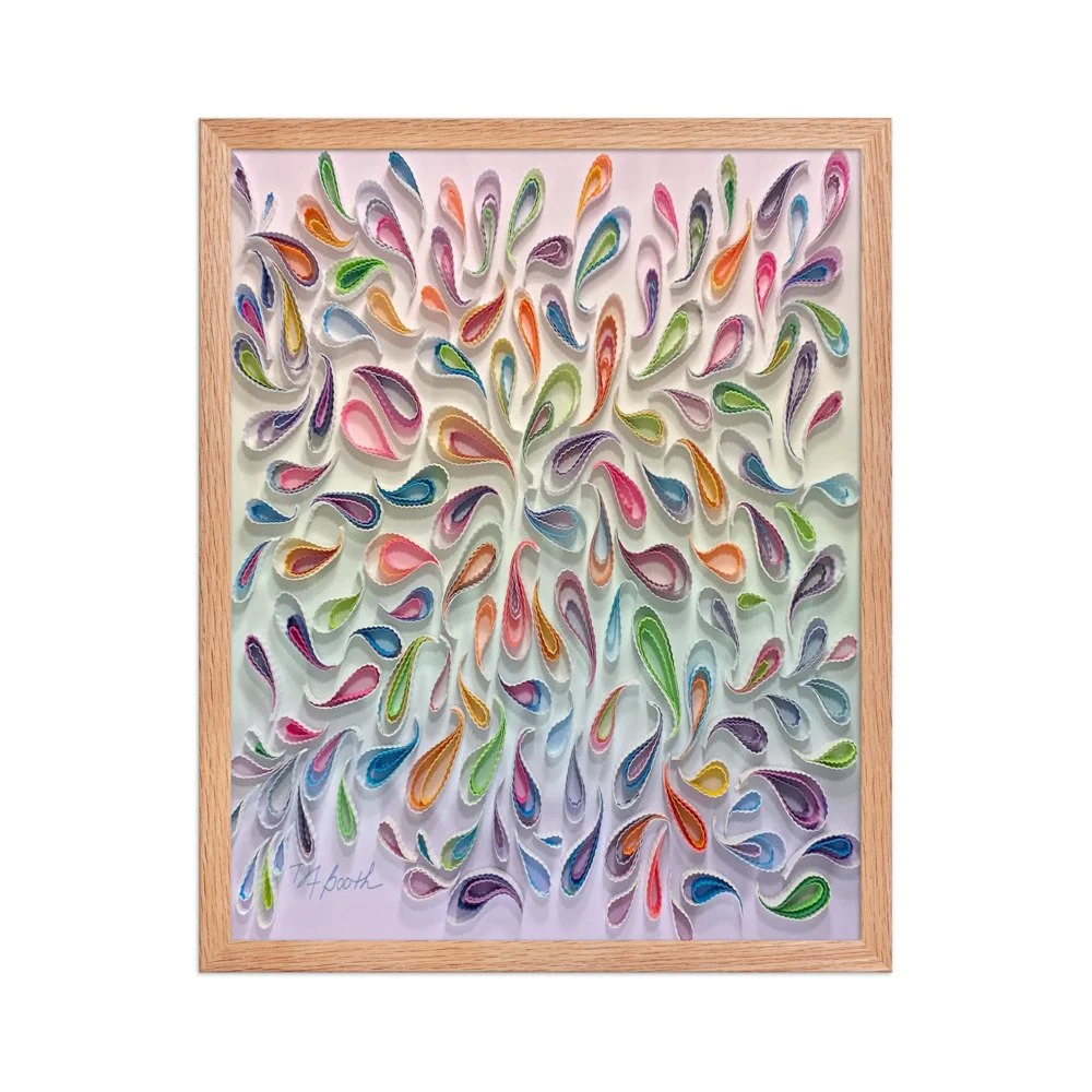 Image 3 of 9
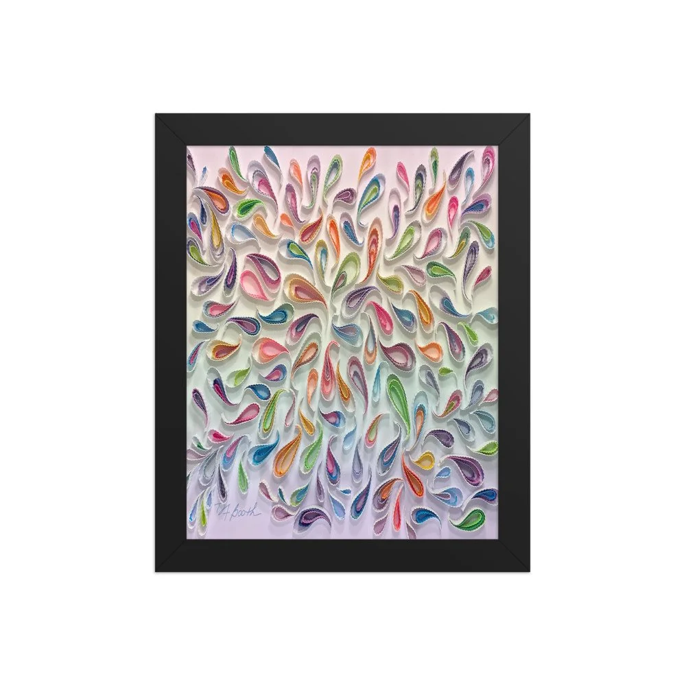 Image 4 of 9
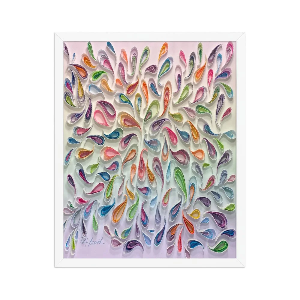 Image 5 of 9
 Image 6 of 9
 Image 7 of 9
 Image 8 of 9
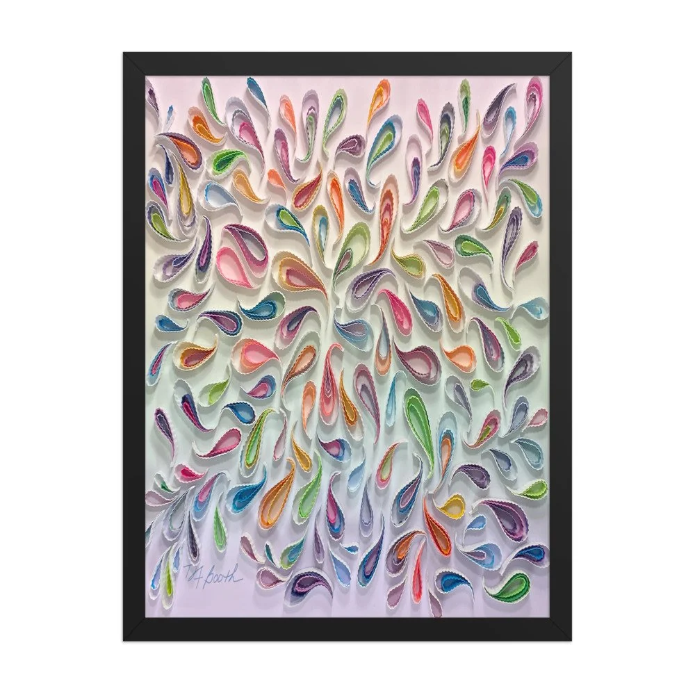 Image 9 of 9