![]() Image 1 of 1
Image 1 of 1
calibration grid 4000x3200 – Framed Poster
This is a full-spectrum color chart built entirely from quilled paper coils. You're looking at hundreds of narrow strips of colored paper, each one hand-rolled into tight spirals and arranged in a precise grid. The piece moves from deep reds on the left, through oranges and yellows, into greens and teals, then blues, purples, and finally magentas on the right. Each color block is labeled with its hex code, turning the whole thing into both an artwork and a functional reference tool.
What makes this piece work is the constraint I gave myself: use only the coils I already had on hand, no new materials, no shortcuts. That meant sorting through hundreds of pre-made spirals, finding the right shades, and placing each one exactly where it needed to go. The grid structure keeps everything organized, but the hand-rolled nature of each coil means no two are perfectly identical. You can see the slight variations in tightness and shape if you look close.
The numbers 1, 2, 3, and 4 mark specific color points across the spectrum, like anchors drawing your eye through the journey. It's the kind of piece that works on multiple levels. From across the room, it reads as a clean, graphic color reference. Up close, you see the individual paper strips, the way they catch light, the human hand behind every placement. It's practical and beautiful at the same time.
The framed poster version preserves every detail of the quilled original while making it gallery-ready. The matte art paper surface keeps the colors rich without glare, and you can still see the subtle shadows where each coil sits. The frame gives the spectrum a clean, finished edge that works in any space. The hex codes remain legible and useful, turning this into something you can actually reference while it hangs on your wall.
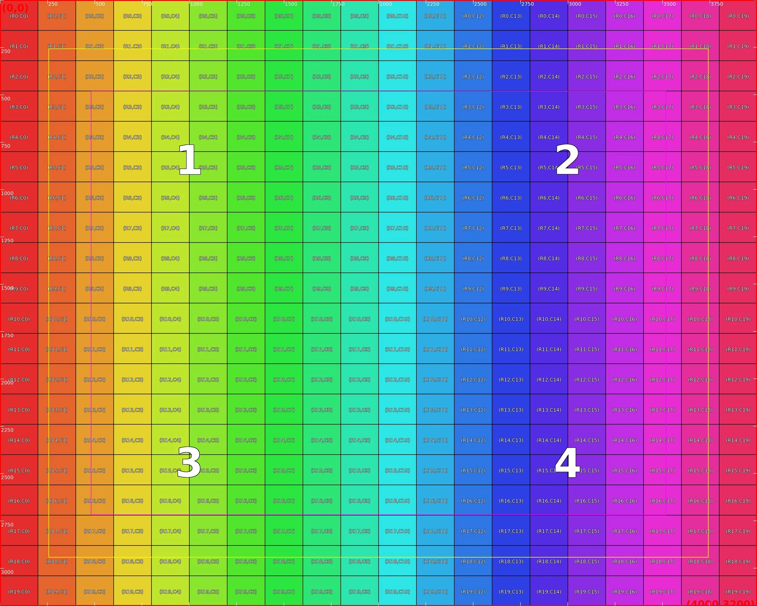 Image 1 of 1